
Analytics dashboard
PRISM
Cost depends on the pages and features you need. Booking, payments and management tools are scoped separately. View starting prices
Project overview
The thinking behind the project
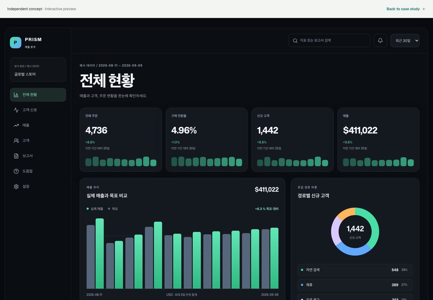
A responsive analytics dashboard connecting KPIs, revenue, channels, cohorts, orders, and priority signals in one flow.
Attractive charts are less useful if their totals and tables do not share the same basis. PRISM updates metrics, charts and tabular detail together when the date range changes. The concept covers the full reading sequence: recognize a pattern, inspect exact values and export the underlying daily data.
- Who this concept is for
- Service operators moving between summary metrics and the underlying numbers
- Industry
- Analytics · Business Intelligence
- Scope
- Dashboard UX/UI · Design System · Responsive Development
- Project type
- Independent design & development concept
Strategy and design
Turning the brief into design decisions.
Deep graphite surfaces, mint and cyan signals, layered cards, and a disciplined sidebar make dense data faster to read.
What the project set out to address
- Make KPIs and changes immediately comparable
- Unify different data expressions within an original visual system
- Preserve information priority across desktop and mobile
How we approached it
- Design the workspace, navigation, and information hierarchy from user goals and operating scenarios
- Create CSS-based KPI trends, revenue comparison bars, channel donut, cohort heatmap, and order pulse modules
- Provide clear, accessible navigation states across the desktop sidebar and mobile header
One dataset, from summary to source
Choose 7, 30 or 90 days to update the metrics, charts and tables together. Inspect exact values and download the daily CSV.
Explore this screen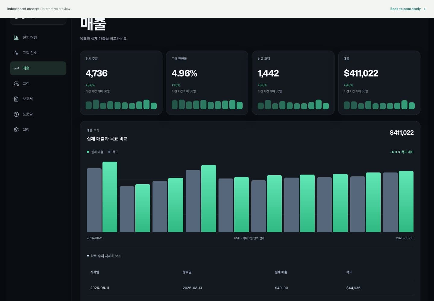
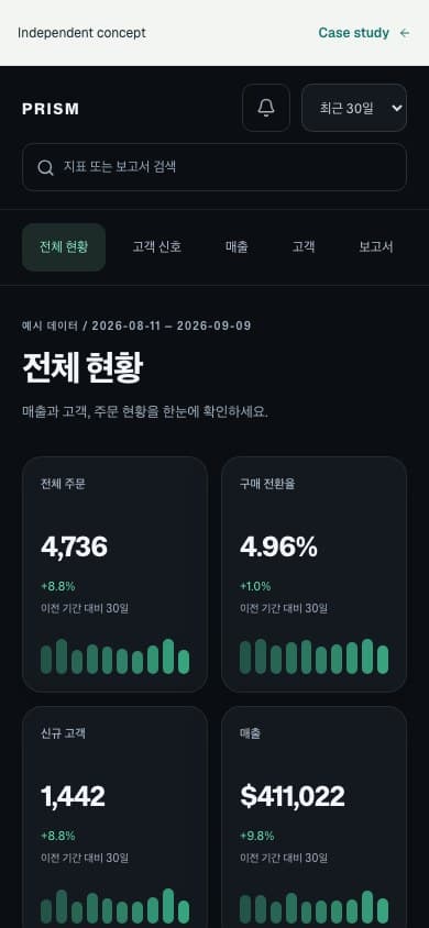
03 / On a smaller screen
Same character. Smaller canvas.
Navigation tabs replace the sidebar; search and date controls remain available on mobile.
Pages and screens in the concept
Project scope
What we created for this concept
We independently conceived PRISM Analytics OS as a fictional product for reading complex operating data and deciding what to do next, designing everything from the brand to the chart system.
- Dashboard information architecture
- Chart components
- KPI card system
- Dark analytics theme
- Responsive web implementation
- Keyboard and screen-reader accessibility
An independent concept, not a client engagement or a performance claim. Products, prices and data are illustrative. A production project requires real operating information and system integrations.
What should your customers experience?